

The Blue Hour - Retail Design Project
September 2022
Being one of the owners of The Blue Hour, I had the flexibility to experiment with the design and processes. This became a perfect first project for me to work on. My process was very intuitive as I had not learnt Interior Design at this time.
The journey of designing our store taught me a lot, while I became certain about choosing this path of design as my future plan. I would also like to thank my friend Vinay, whose experience in the construction industry provided me with the on-ground technical support and a great team to execute my ideas with.
Part 01 - Logo Design
An initial visualisation
The idea behind designing the logo was:
- It should be 'hand-made'
- It should reflect the Indian style
- It must be decorative
I started with drawing the initials 't b h' on Procreate app on iPad ( 01 ) and creating its variations on Illustrator ( 02 ). I chose Pantone Classic Blue as the true representation of the particular hue of the blue hour in nature ( 03 ).
01


02

03
Final design
I finalised a refined version of the initial play of typography in a simple shape.


Part 02 - Retail Store Interior Design
Concept & Inspiration
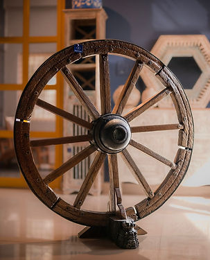
Drawing inspiration from the graceful arches of Rajasthan, many of the reclaimed pieces at The Blue Hour originate from Rajasthan and Gujarat.
I visited Rajasthan again to gather inspiration and capture everything that became a part of my mood-board. The washed-off textures, intricately carved arches, doors, and vibrant hues, set a distinctive and inviting tone for the store's interiors.
The second source of inspiration was the blue hour itself—a magical time that occurs in nature every day twice.


The Process...
The very first vision I had for the storefront. I used this vision as a starting point to learn SketchUp.
01 - SketchUp
02 - Adobe Photoshop
01

02
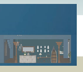
A simple and attractive manner of incorporating arches in the interiors. This was a unit made out of gypsum plaster and MDF.
It truly did not work out the way I expected it to mainly because it could not hold enough weight and the color blue did not highlight all artefacts to the best of their ability.
I had to change its colour thrice: Blue to a cream wallpaper, and then finally to rust. Rust color with texture, along with LED downlights made even the simplest of artefacts stand out.


Some sketches I created towards
space-planning to understand the placement of decor items and furniture, and traffic flow.


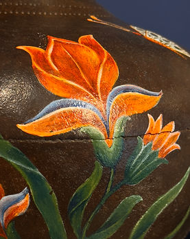
As an experiment I hand-painted a few of the artefacts. The painting on old wood and iron brought a new life to these pieces — falling in right alignment with The Blue Hour store's philosophy.


The final outcome resulted into a vibrant and warm boutique store. The space had the right recipe to look like a treasure-trove, that our customers enjoy. As a final touch I added indoor plants, a soft oud fragrance and indian classical ambient music.
All product and store images have been photographed by me.

.jpeg)


.jpeg)